Police badges, ID cards, and access passes serve as identifiers, but they’re also symbols of trust, authority, and safety. Designing these items for law enforcement requires striking a balance between practicality (including security features and clarity) and symbolism to honor the department’s identity.
In this guide, we’ll look at best practices to create effective law enforcement badges, officer ID cards, and access passes that meet high standards for security and professionalism.
Designing Impactful Police Badges
The police badge is arguably the most recognizable element of an officer’s uniform. A well-designed badge instantly conveys authority and the values of the department. When designing or updating a badge:
● Incorporate Meaningful Symbols:
Most badges include shapes and emblems with rich symbolism. For example, many sheriff’s offices use a star-shaped badge, a tradition dating back to the Old West where they thought these symbols had magical properties that ward off evil). Modern city police often favor shield shapes, representing protection and defense.
Custom symbols, such as state seals, eagles, scales of justice, or local landmarks, can personalize the badge to reflect the community. Every element (from a laurel wreath border to the number of points on a star) can tie into the department’s heritage or mission.
● Ensure Instant Recognition:
The general public should be able to identify law enforcement by their badges. This means choosing recognizable symbols (like the circle, shield, or star). They should also include clear text for the department name, along with optional details like rank or badge number. Pick high-contrast and well-defined text and imagery, too.
Remember, the badge’s design must communicate “police” or “sheriff” at a glance; it’s generally not the place to experiment with abstract or overly trendy designs.
● Quality and Durability:
Badges are often worn daily for years or decades. They need to be durable. With that in mind, they’re typically made of metal with sturdy clasps and finely crafted.
High-quality badges survive wear and tear, but they also signal that the department holds its symbol (and by extension, its duty) in high regard.
● Consistent Branding:
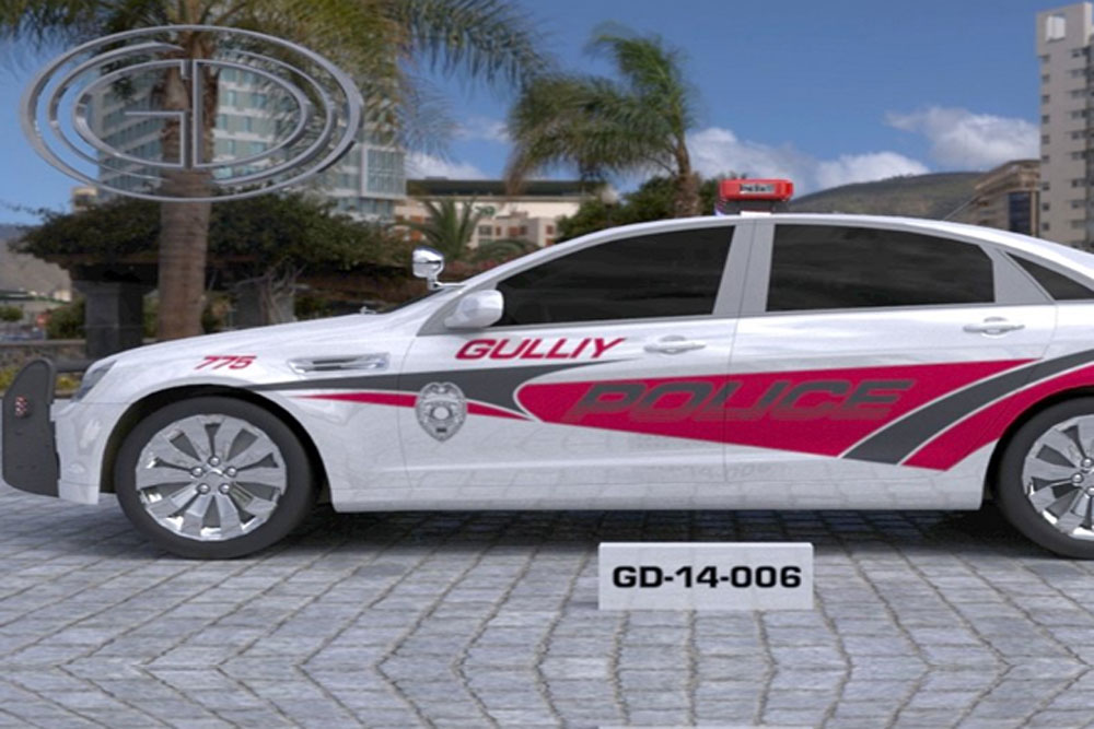
When designing a new badge, consider how it aligns with the department’s broader branding. The badge often appears on other materials (patches, vehicle decals, websites, ID cards). Using the same core elements (the same seal or motto) across platforms reinforces the department’s identity.
Say a police department has an official seal featuring a cityscape and a specific motto. In this case, that seal should be incorporated into the badge, the shoulder patch, and even printed IDs. This consistency builds trust through a unified image.
In summary, the best police badges marry form and function: they are visually striking and symbolic, yet unmistakably official and built to last. When an officer pins on that badge, it should embody the honor and responsibility of the role, and the design plays a big part in that.
Top Tips for Designing Secure and Clear Police ID Cards
A badge is a symbol, but an ID card is a daily working credential. It needs to identify officers (or authorized personnel) clearly and be resistant to tampering or forgery.
Here are fundamental best practices for law enforcement ID cards:
1. Use Advanced Security Features:
Modern police ID cards often include multiple anti-counterfeit elements. A holographic overlay is a popular choice. This is when you tilt the card, and an official hologram (like a state emblem or “POLICE” text) appears. It’s meant to prove the card’s authenticity.
Incorporating a ghosted image (a faint, second copy of the officer’s photo) is another effective measure. This prevents someone from simply swapping the photo, because a would-be forger would have to alter both the main photo and the ghost image…something that’s nearly impossible without detection.
Overlapping data is a clever trick, too: for instance, printing the officer’s badge number or card issue date so that it overlaps part of the photo or ghost image. If anyone tries to replace either element, the mismatch is obvious. Together, these features make an ID extremely hard to duplicate or alter.
2. Include Official Endorsements:
Some departments choose to print the chief’s or director’s signature on the card, as well as the department’s seal or logo. The department seal, ideally as a watermark or part of the hologram, makes it immediately clear that the ID is issued by a legitimate authority.
The card design should prominently display the department name and emblem. It should be obvious which agency the ID belongs to without requiring scrutiny.
3. Prioritize Clarity of Information:
The card’s primary purpose is identification.
With that in mind, make sure:
- It has a large and clear photo of the officer
- The name and rank are easy to read
- The badge or ID number is prominent
Some departments print a large badge number on the card that corresponds to the officer’s metal badge. It’s easy to cross-verify this way.
Use a clean font and avoid clutter. If additional details (such as height, eye color, or employee ID) are required, they can be included on the back of the card.
The front of the badge should show the essential info in a well-organized way. Often, that looks like the photo on the left and the info on the right—whatever makes it legible at a glance.
4. 24/7 Verification Info:
It’s considered a best practice to print a contact number (and/or website) on the ID that anyone can call to verify the ID’s validity.
This way, people can double-check an officer’s identity if needed (helping prevent impersonation scams). It also aids in returning lost ID cards to the department. Including an office address for return is useful too.
5. Leverage Both Sides of the Card:
Use the back of the ID card for supplementary information that isn’t critical for an immediate ID check but could be helpful. Some departments include details like the officer’s blood type or medical info in case of emergency.
Others print brief instructions for public users (e.g., “This card is property of XYZ Police; report found cards to the above number.”). You might also include a QR code that, when scanned by hospital or security personnel, confirms the card’s authenticity or retrieves the officer’s credentials from a database (only accessible to authorized devices).
These tech options can modernize an ID, but they should complement, not replace, traditional visuals. Ultimately, a human being still needs to be able to read the card without requiring any special tools.
Smart Access Passes for Secure Facilities
Access passes (keycards or access IDs) for law enforcement facilities (like police headquarters, evidence rooms, or secured parking) share many design aspects with officer IDs, but they emphasize controlled access.
When designing access passes, keep these in mind:
● Differentiate Access Levels Visually:
If there are tiers of access (e.g., civilian visitor, sworn officer, contractor), color-coding or using distinct badge designs for each group might be the way to go. For instance, a temporary visitor pass might be bright red with “VISITOR” in bold text, while an officer’s pass is blue with the department badge.
This way, at a glance, security personnel can tell if someone should be in a specific place or not. A simple colored stripe or border can often suffice without requiring entirely separate designs.
● Include Photo and Identity Info:
Even if an access card is primarily scanned by a reader, it should display a photo ID and name, if space allows, especially in law enforcement settings where visual confirmation is crucial. A security guard might double-check the face against the photo on the pass.
Include affiliation or department as well (for example, a crime lab technician vs. a records clerk might have different access, so the card should state their division or role).
● Embed Technology Securely:
Use printed design to highlight any embedded tech. Many access passes have an embedded chip or RFID antenna.
While that’s invisible, you can print a notice like “Prox Card” or use an icon to indicate it’s a smart card. Also, number each card (employee number or card serial) in print. This way, if one is lost, it can be reported by number.
Printing “Expires: [date]” for short-term passes (such as a contractor working for three months) is a good security practice to prevent old passes from circulating. It reminds both the user and security when the pass is no longer valid.
● Follow the Same Security Print Practices:
Don’t skimp on visual security for access cards! They should ideally include the organization’s seal, maybe a hologram overlay as well, just like IDs. This prevents someone from printing a fake access card that might fool a quick visual inspection.
Law enforcement facilities are sensitive areas; an extra hologram or distinctive foil stamp on an access pass can thwart an attempt by an intruder using a counterfeit card.
● User Convenience and Durability:
Design the pass so it’s easy for staff to carry and use. Standard credit card size is best—it fits in wallets and common badge holders. Rounded corners prevent snags. Lamination or composite plastic printing will ensure the card lasts through daily use.
Consider printing orientation, too. If people swipe the card through a reader, print text in the direction that they naturally hold the card. Little usability touches like this make life easier for officers and staff who might use their access card multiple times a day.
Expertly-Designed Law Enforcement Badges
Designing law enforcement badges, ID cards, and passes is a specialized task that merges graphic design with security engineering.
When you outsource your graphic design needs to professionals, make sure you’re choosing a company with specific experience in law enforcement badges. One such company is GDI Graphics, who specialize in police, security, fire, and sheriff graphics.


